
Fleet Wrap Design: Dos, Don'ts & Color Psychology
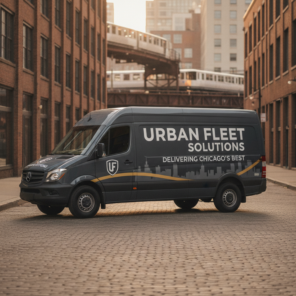
A fleet wrap either earns attention in three seconds or wastes every dollar you spent on it. Good design is not about looking cool. It is about making your phone number readable at 65 mph on I-90 while a driver glances left. After wrapping 19,400+ vehicles and holding 2,800+ active fleet accounts across Chicagoland, Chicago Fleet Wraps has seen every design mistake, and we have the job records to show which choices actually convert.
A fleet wrap either earns attention in three seconds or wastes every dollar you spent on it. Good design is not about looking cool. It is about making your phone number readable at 65 mph on I-90 while a driver glances left. After wrapping 19,400+ vehicles and holding 2,800+ active fleet accounts across Chicagoland, Chicago Fleet Wraps has seen every design mistake, and we have the job records to show which choices actually convert.
Why Design Is the Difference Between a Rolling Billboard and Rolling Wallpaper
Your wrapped cargo van will sit in traffic on the Kennedy, park outside a Lincoln Square storefront, and idle at a Wicker Park loading dock. Each setting changes lighting, viewing angle, and competing visual noise. A design that looks stunning on a laptop screen can disappear against a gray Chicago sky or get lost in the visual chaos of a Fulton Market block.
This is a field manual. We will go through what works, what fails, and why, based on 25 years of installs since our founding in 2001 here in Portage Park.
The Dos of Fleet Wrap Design
Do Lead With One Clear Message
Pick one thing you want a driver to remember. Your company name. Your phone number. Your service category. Not all three equally. Not five services listed in bullet points. One anchor message. Everything else supports it.
A plumbing company running a van through Rogers Park does not need to list every service on the side panel. It needs "Emergency Plumber" in large type and a phone number below it. That is the whole job.
Do Use High-Contrast Color Pairings
Contrast is readability. White text on yellow fails. Black text on dark navy fails. These combinations look fine at arm's length and collapse at speed. The combinations that hold up on Chicago streets, in overcast light, in rain, and at dusk are:
- White or yellow text on black or dark navy backgrounds
- Black text on white or light yellow backgrounds
- Bright red or orange on white
- White on deep green or dark blue
Test your mockup in grayscale. If the message disappears, your contrast is not strong enough.
Do Size Your Phone Number for Highway Viewing
The side panel of a cargo van is roughly 80 inches wide and 40 inches tall. A phone number needs to be at least 6 to 8 inches tall to read from a car in the next lane at 55 mph. Most designers size it too small. If your phone number is smaller than your tagline, the design is wrong.
Do Use Cast Vinyl, Not Calendered
This is a materials decision that directly affects how your design looks two years from now. We use cast vinyl exclusively, specifically Avery Dennison MPI 1105 Supercast and 3M IJ180-CV3 with UV overlaminate, along with the newer 3M IJ280. Cast vinyl conforms to curved panels, door handles, and body lines without lifting or shrinking. Calendered vinyl is cheaper and it shows. Colors shift. Edges lift. The design that looked sharp on day one looks worn and unprofessional by month eight.
Do Keep Logo Placement Predictable
Logos go upper left on the driver side, centered or upper center on the rear panel, and mirrored on the passenger side. That is the standard. Deviating from it for visual interest usually means viewers spend time figuring out the layout instead of reading the message. Predictable placement is a feature, not a limitation.
The Don'ts of Fleet Wrap Design
Don't Use More Than Three Fonts
One font for your company name, one for supporting text, one for contact information. Maximum. Every additional font adds visual noise and slows comprehension. Script fonts are a specific trap. They look elegant in a PDF and become unreadable at speed on a rain-slicked Lower Wacker Drive.
Don't Fill Every Inch of the Panel
Empty space is not wasted space. It is breathing room that makes the elements around it easier to read. Designs that pack every panel with images, gradients, slogans, service lists, and social media handles are exhausting to look at. Viewers do not slow down to decode them. They look away.
Don't Ignore the Vehicle's Body Lines
Door seams, wheel wells, handles, and antenna mounts all interrupt a design. A phone number that breaks across a door seam becomes two partial numbers. A logo that sits directly over a wheel arch gets distorted. Send your designer the vehicle's exact year, make, and model, and get a template that accounts for these interruptions before any artwork is finalized.
Don't Use Photographic Backgrounds on Dark Vehicles
A dark blue cargo van with a dark photographic background is a visibility disaster. The vehicle's base color bleeds into the image and you lose the whole design in low light, which is exactly the condition you face on Chicago streets from November through March. If you want photography, pair it with a high-contrast color block that anchors the text.
Don't Skip Brand Standards for Fleet Consistency
If your company runs ten vans and each one has slightly different colors, different logo versions, or different taglines, the fleet does not read as a fleet. It reads as ten unrelated vehicles. Fleet consistency is brand equity. Every vehicle should be identical in layout, color codes, and typography. We hold exact color profiles for all 2,800+ active fleet accounts we manage so that vehicle number 25 matches vehicle number one.
Color Psychology for Commercial Vehicles
Color is not decoration. It is the first message your vehicle sends before anyone reads a word. Here is how the major color families perform in the commercial vehicle context, based on what we observe across our job base.
Blue reads as trustworthy and professional. It works for financial services, HVAC, and healthcare. It is also the most common fleet color, which means it risks blending in on a crowded Chicago block.
Red and orange create urgency and energy. They read well at distance and in low light. Strong choice for food delivery, emergency services, and trades companies that want to signal speed.
Green communicates environmental responsibility and health. It performs well for landscaping, organic food brands, and green energy companies. Avoid dark greens on vehicles, as they disappear in tree-lined neighborhoods like Andersonville and Beverly.
Black and white communicate premium positioning. Black vehicles with white text read as high-end. The limitation is heat absorption. A fully blacked-out wrap on an unshaded vehicle will run warmer. This matters for installations, and it is why our climate-controlled install bay matters for the application itself.
Yellow is the highest-visibility color at distance and in low light. Construction companies know this. It is underused by service businesses that could benefit from it.
Brand Messaging Rules for Fleet Wraps
Your vehicle wrap is not a website. It does not have a scroll bar. A viewer has between two and five seconds of exposure. Every word on that vehicle needs to earn its place in that window.
Rule 1: Name, service category, phone number. That is the minimum viable message. If the wrap delivers those three things clearly, it is doing its job.
Rule 2: Website URLs are secondary. A URL is hard to remember at speed. A phone number is easier. Put the number bigger. Put the URL smaller if you include it at all.
Rule 3: Slogans must be short or gone. If your slogan is longer than five words, cut it or drop it. "Serving Chicago Since 2001" works. "Committed to delivering excellence in every project we take on" does not.
Rule 4: Social handles belong on rear panels only. A driver behind you at a red light has time to glance at an Instagram handle. A driver alongside you on the expressway does not. Keep social information to rear panels where dwell time is higher.
Real Numbers From the Field
Chicago Fleet Wraps has wrapped 19,400+ vehicles since 2001, maintains 2,800+ active fleet accounts, and has logged zero verified paint-damage claims across that entire history. Those numbers reflect what happens when materials, installation environment, and design execution all work together. We use 3M Knifeless Tape for all panel cuts, which eliminates blade contact with paint. Our installs happen in a climate-controlled Chicago bay, not a cold parking lot in February. Design quality matters, but it is only one piece of a wrap that actually lasts.
The Cost Reality
A full cargo van wrap starts at $4,200. That covers materials, installation, and our 2-year workmanship warranty. The wrap itself will perform for 5 to 7 years on cast vinyl with UV overlaminate. Spread $4,200 over five years and you are paying less than $70 per month for a vehicle that markets your business every time it moves.
Fleet discounts apply per single contract: 3% for 2 to 4 vehicles, 7% for 5 to 9, 11% for 10 to 24, and 15% for 25 or more. For a company running 25 vans, that 15% discount on a $4,200 base price is real money. We also offer free pickup and delivery across Chicagoland, so you are not losing work time moving vehicles to us.
The design process fits inside our 8-day production lifecycle, and we provide 2-hour itemized quotes so you know exactly what you are approving before we touch a panel.
People Also Ask
What are the most common fleet wrap design mistakes?
The most common fleet wrap design mistakes are overcrowding the panels with too much text, using low-contrast color combinations that fail in low light or at speed, sizing the phone number too small to read from a moving vehicle, and ignoring the vehicle's body lines during layout. A phone number on the side panel needs to be at least 6 to 8 inches tall to be readable from a neighboring lane at highway speeds. Designs should limit messaging to company name, service category, and contact information, with everything else treated as secondary.
How does color psychology apply to commercial vehicle wraps?
Color psychology in fleet wraps is about the immediate impression a vehicle makes before anyone reads the text. Blue signals trust and professionalism and works for service industries. Red and orange communicate urgency and energy, which benefits trades and delivery businesses. Yellow delivers the highest visibility at distance and in low light. Black and white combinations signal premium positioning. The practical constraint in Chicago is that dark colors, including dark green and dark navy, lose visibility in overcast conditions, which are common from fall through spring.
What is the difference between cast vinyl and calendered vinyl for fleet wraps?
Cast vinyl is manufactured by spreading liquid vinyl into a mold and then curing it, which produces a thinner, more conformable material that holds its shape and color over time. Calendered vinyl is made by pressing vinyl through rollers under heat and pressure. It is cheaper but thicker, less flexible, and prone to shrinking and lifting, especially around curves, door handles, and body lines. For commercial fleet wraps, cast vinyl is the correct choice. Chicago Fleet Wraps uses cast vinyl exclusively, including Avery Dennison MPI 1105 Supercast and 3M IJ180-CV3 with UV overlaminate, and never installs calendered material.
Next Step
If you are ready to get a design review or a quote on your fleet, call Chicago Fleet Wraps at (312) 597-1286. We are at 4711 N Lamon Ave #7 in Portage Park. We turn around itemized quotes in 2 hours and handle pickup and delivery across Chicagoland at no charge. Bring your logo files, your vehicle list, and your brand colors. We will take it from there.
Written by Roy Wraps, Chicago Fleet Wraps
Ready for a quote? See Van Wraps Chicago or get an itemized quote in 2 hours.
Frequently Asked Questions
What are the most common fleet wrap design mistakes?
The most common mistakes are overcrowding panels with too much text, using low-contrast color combinations that fail in low light or at speed, sizing phone numbers too small to read from moving vehicles, and ignoring the vehicle's body lines during layout. A phone number on the side panel needs to be at least 6 to 8 inches tall to read from a neighboring lane at highway speeds. Keep the core message to company name, service category, and contact information.
How does color psychology apply to commercial vehicle wraps?
Color is the first message your vehicle sends before anyone reads the text. Blue signals trust and works for service industries. Red and orange communicate urgency and benefit trades and delivery businesses. Yellow delivers the highest visibility at distance and in low light. Black and white combinations signal premium positioning. In Chicago, dark colors including dark green and dark navy lose visibility in the overcast conditions common from fall through spring.
What is the difference between cast vinyl and calendered vinyl for fleet wraps?
Cast vinyl is manufactured by spreading liquid vinyl into a mold and curing it, producing a thinner, conformable material that holds its shape and color over time. Calendered vinyl is pressed through rollers under heat and is cheaper but thicker, less flexible, and prone to shrinking and lifting around curves and door handles. Chicago Fleet Wraps uses cast vinyl exclusively, including Avery Dennison MPI 1105 Supercast and 3M IJ180-CV3 with UV overlaminate, and never installs calendered material.